Document mobile web-view behavior
I started translating the issues found in the audit into practical guidance for desktop designers, focusing on how embedded web views should look and behave within the mobile app.
Google · Native mobile + AI
Leading the Cloud Mobile redesign — bringing personalized insights, actionable widgets and Gemini assistance into one native-mobile experience.
Explore the case ↓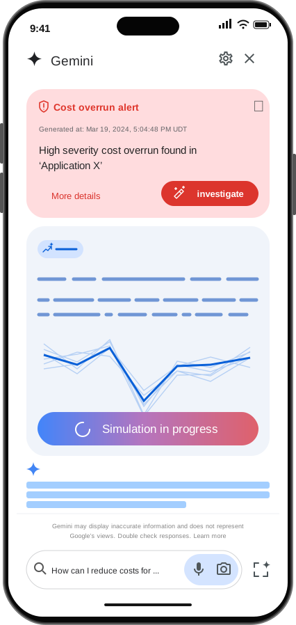
01 / The problem
Cloud Mobile offered less functionality than desktop, with journeys split between native screens and embedded web views. Inconsistent interactions and mental models made moving between platforms harder than it needed to be.
Behind the interface, multiple product teams worked without a shared mobile framework. A new backend, server-driven UI and AI workflows were evolving in parallel. The challenge was to establish a coherent mobile direction while both the product and its architecture were changing.
From February to September 2025, I led the redesign and alignment across web UX, mobile engineering, platform and AI teams.
02 / The audit
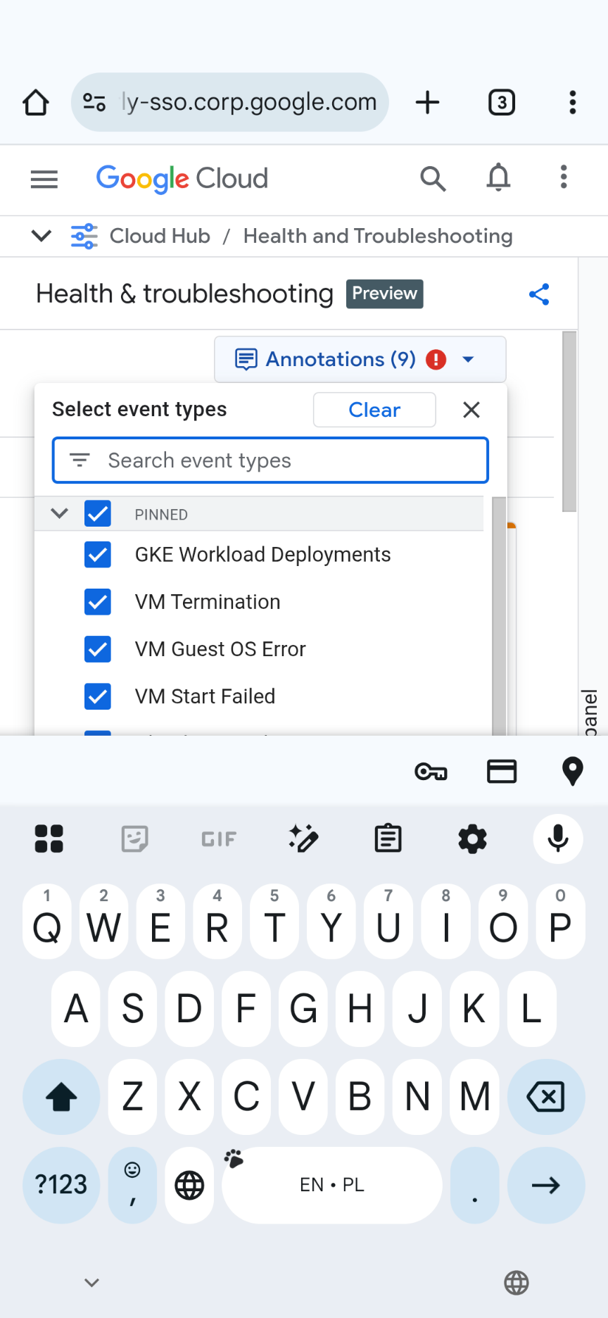
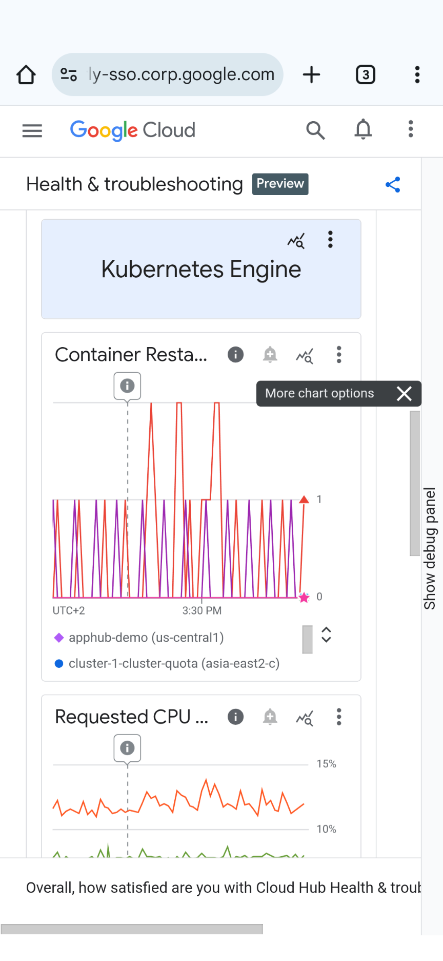
I audited the web views embedded in the mobile app, mapping user flows, breakpoints and interaction mismatches. The focus was on where desktop assumptions broke down in a mobile context, not just on visual inconsistencies.
The audit showed that the embedded pages were not adapted for mobile screens. Desktop layouts led to clipped content, overflow and controls that were difficult to use on smaller screens.
 console.example.com
 console.example.com
03 / Key decisions
I began documenting how embedded web views should look and behave on mobile, giving desktop designers guidance for adapting their experiences to smaller screens.
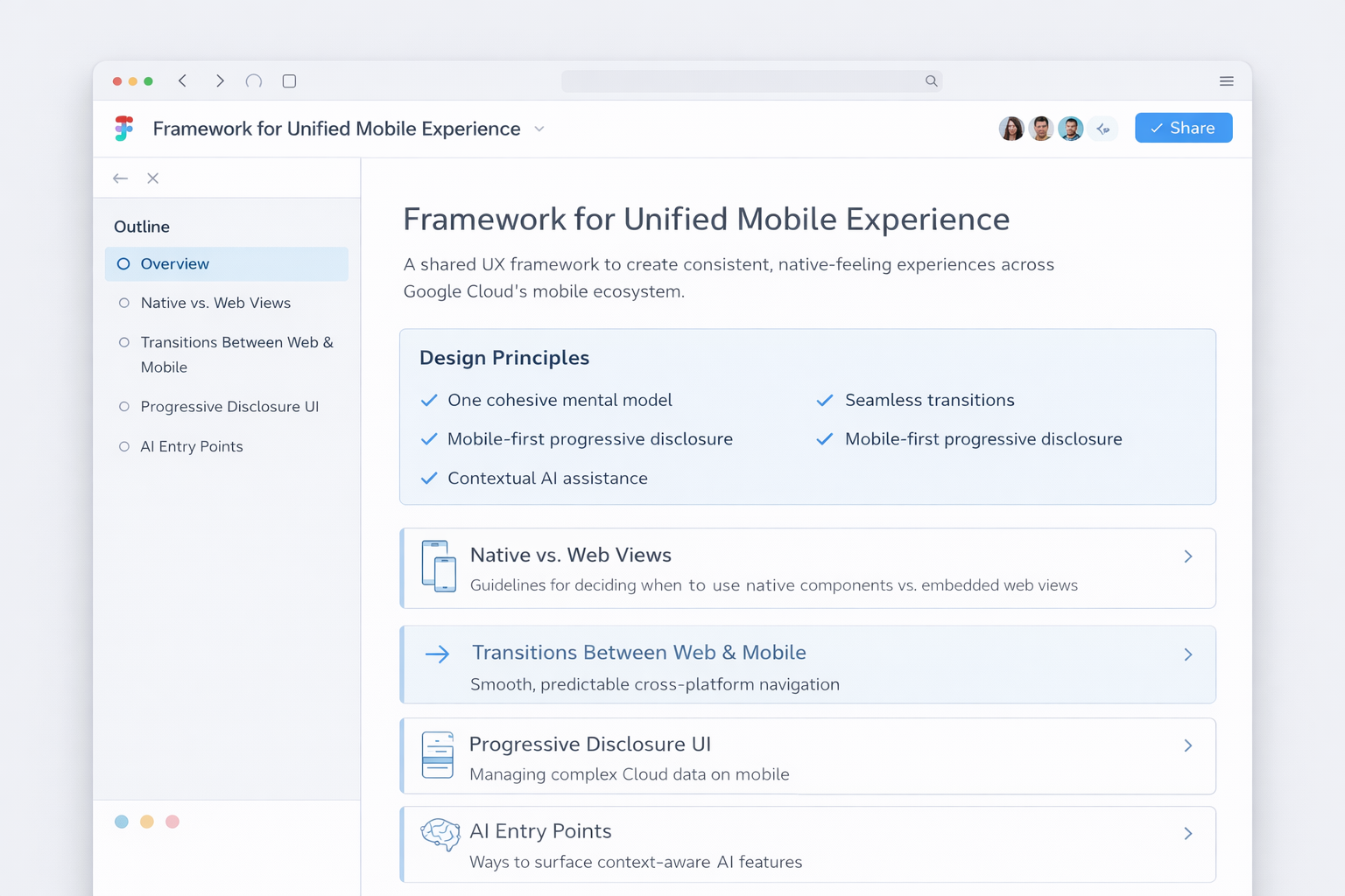
I started translating the issues found in the audit into practical guidance for desktop designers, focusing on how embedded web views should look and behave within the mobile app.
I defined mobile AI interaction patterns that support the task at hand, interrupt only when valuable and include guardrails for trust and explainability.
I co-designed the adaptation to server-driven UI with platform engineers, defining flexible component rules, states and behaviors across native iOS and Android.
04 / The experience
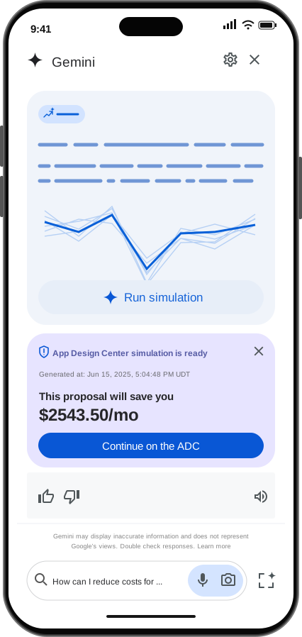
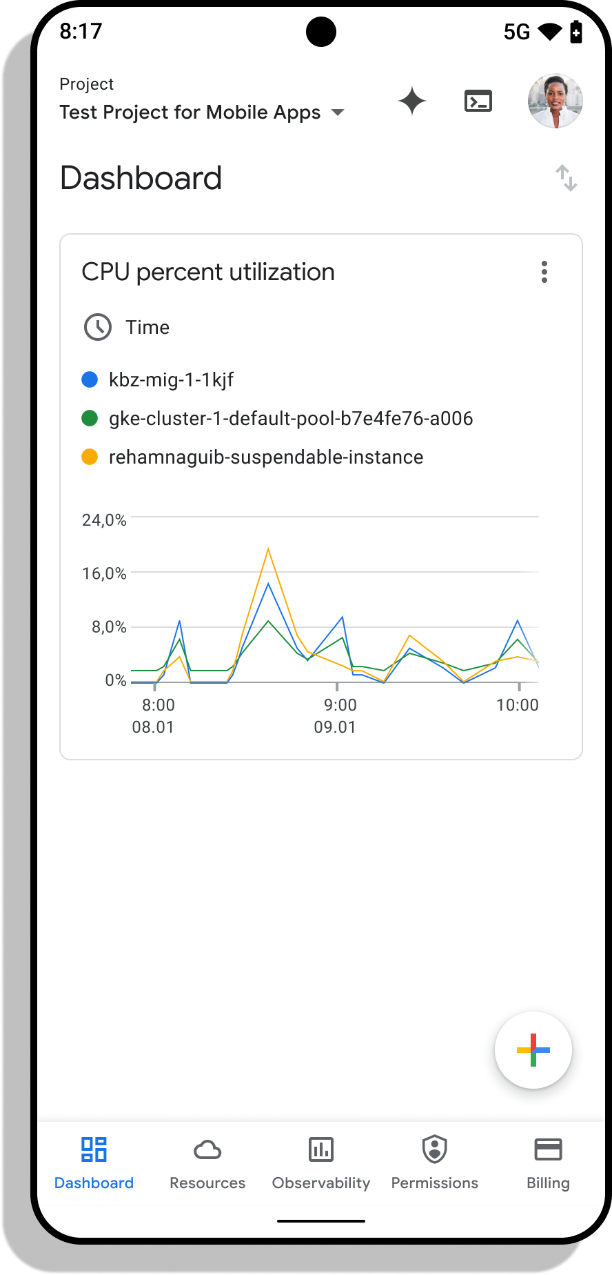
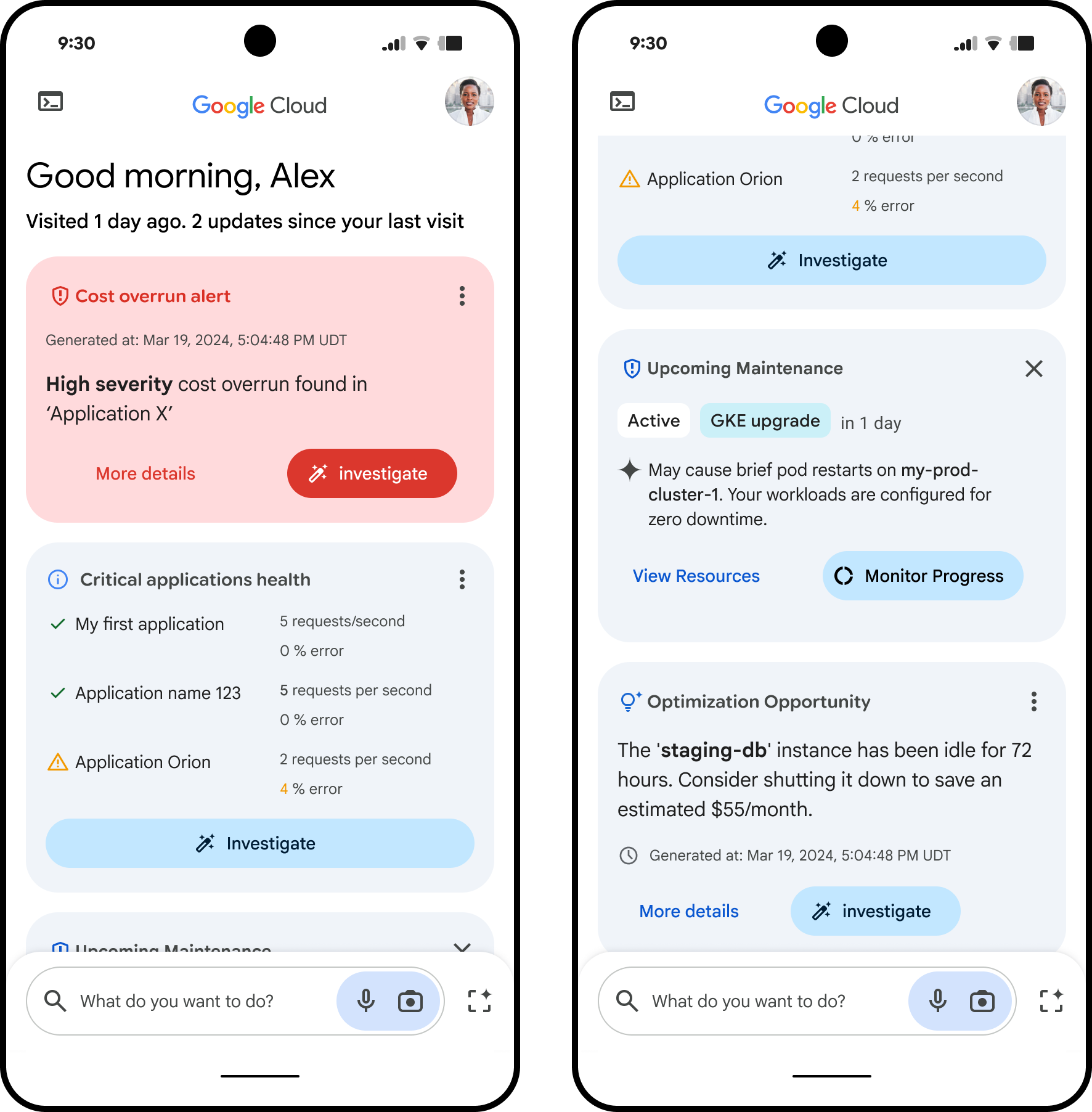
A personalized feed brings priority insights to mobile. Actionable widgets and Gemini Cloud Assist connect those insights with explanations and next steps.
Personalized feed
The feed brings together personalized cloud insights. Actionable widgets connect each insight with a relevant next step.
This gives ongoing cloud work a mobile entry point, rather than treating the phone as a separate experience.
Cross-device continuity
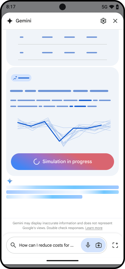
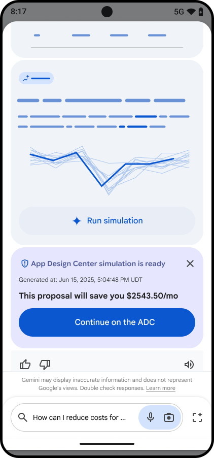
Start a task on mobile and pick up exactly where you left off on desktop — or the other way around. Gemini-assisted optimization shows how the workflow carries across devices, without losing context or starting over.
05 / User validation
The redesigned experience was evaluated with 12 experienced Google Cloud users in 90-minute moderated sessions focused on real workflows.
All 12 participants reported faster task completion and clearer navigation with less friction. All responded positively to the simplification.
The ability to switch between mobile and desktop and pick up where they left off was a particular source of delight.
These are early findings from a small qualitative study. Faster task completion reflects participants’ reports, not a measured reduction in task time.